
Spotify’s New York office is any teenage boy’s dream.
We are not talking just about the obvious perks of working for a hip startup or the array of cool musicians parading through the office. We are talking about the New York office’s unofficial mascot: Spiderman.
The walls separating many of the office’s nooks and crannies have been removed, only to be replaced by spiderwebs of sorts that perfectly complement the office’s main mural of Spiderman in various positions as he goes on to save the world.
The open spaces and multiple murals aren’t there to just foster creativity, but also to remind Spotify employees of the power they hold and the way they can and do affect Spotify users everyday. Turns out, it’s not Peter Parker’s secret identity that appeals to the Swedish startup, but rather his motto, first uttered by Uncle Ben: “With great power comes great responsibility.”
While the company loves Peter Parker, it wants to avoid Peter Pan. Spotify doesn’t want to stay a little kid forever.
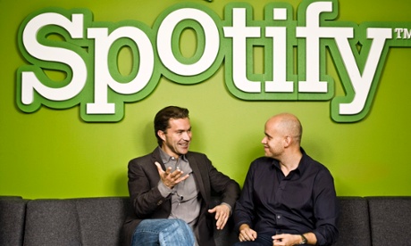
Spotify recently unveiled a new design. The need for redesign became apparent 16 months ago when the company “decided that we need to grow up a little bit,” says Rochelle King, Spotify’s global vice-president of design and user experience.
King, who has been with Spotify for a year and a half, was previously vice-president of user experience and design at Netflix. After Spotify cleaned up its logo, app icon and type interface, it became apparent that its previous design was a “mess”. It was inconsistent across the various devices on which the company’s music streaming app can be used and the fragmented user experience was problematic.
“The thing that was happening was that this was a brand evolving and the product wasn’t evolving. And that was very problematic, because on the outside we looked really nice but then when you actually came in and used the product, it didn’t really match your expectations. We also lacked pretty strong design foundation at that time,” explained King, when we visited the offices as part of the 99U Conference on design.
“We didn’t have design principles that were designed that were defined, we didn’t have a strong visual language. We didn’t have a lot of our patterns and guidelines defined either.”
While many might find that surprising for a company that’s six years old and as large as Spotify, King attributes it to Spotify’s rapid growth.
“Over the course of, I think, two years we grew from 200 people to close to a thousand people. And when you have this kind of rapid growth you don’t always take the time to do this kind of foundational building stuff – really being clear about what our principles are, what we are defining as our visual identity,” she said. “We really felt like we needed to stop and take stock of where we are at and define some of those things.”
Mainly, the design team decided to listen to its customers and what they heard wasn’t always easy to hear. Especially, when Spotify tried switching to white background.
My God, how long does it take? Change it back. I used love chilling to Spotify with the black background. It’s now far too bright. How long does it take, you idiots?”
Still stuck with the terrible white background. Thanks for listening Spotify. I am about to quit this service because looking at your pages gives me terrible headaches.”
“We were constantly seeing these things and not feeling so great about it,” King said, pointing to the comments above. “And the pain was, not just external, but of course internally within the design team we felt a lot of the pain as well.”
After her presentation to the 99U attendees, we caught up with King to talk about the redesign process, what it meant for her team and how Spotify approaches its data.
Excerpt from King’s presentation on the Spotify redesign process:
Anytime you kick off a project, you start by defining the problem and defining what you actually want to accomplish, what you need to do. For us, it was these three things: One, we needed to bring the brand into the product. We really felt that that refreshed logo and typeface and all those things weren’t reflected inside the product. [Two], we wanted to make sure we created our own look and feel, something that we felt was unique to us or at least was a good representation of what we wanted to be. [Three], we also wanted to make sure that we were unified across all of those different platforms.
At Spotify, we use a pretty standard product development cycle process, which is four steps. Think it – where you are basically exploring a lot of ideas, picking a direction and then going in it. A lot of things actually die at this stage. There’s a lot of ideas that you find out just aren’t that valid or just aren’t that good and so you stop working on them at this stage. Then you actually move into build it stage. Before you were really rolling up your sleeves and actually making thing, now you actually have the intent to have this launch out to real customers.
The third stage is shipping it. This when it’s actually going to real users and we always start with a small percent to make sure we are not screwing anything up and we understand how people are reacting to it. But shipping to us is anytime an actual user can play with the product and use it. And then finally, once it gets launched all the way, we go into this tweak it phase, where we are really trying to make that we are reacting to whatever we are hearing and then fixing any issues that come up and optimising it even further.
One thing to mention is that this cycle doesn’t just happen once. Ideally, you’re sort of rinsing and repeating a couple of times, because you will find that you optimise, optimise, optimise, and you’ll sort of hit one of those local maximums. Then you need to take a step back and say, “OK, if we actually rethought how radio works, or if we rethink how some of these things work, could we make it even better?” We kind of go through that cycle a couple of times.
Excerpt from King’s presentation on the role of data in redesign process:
One thing, I want to be clear about is that data actually does equal people. I believe sometimes data, especially in the design community, can have a bit of a bad name because it feels like it’s dehumanising design or it’s taking the art out of the process of designing. For me, one thing I really try to remember is that this data is actually information about how real people are using our product. You always have to tie it back to the fact that what we are measuring is human behaviour.
If you start to reduce it down to a number, then it’s too easy to forget about what you are actually doing to your customers. And that’s dangerous. The important thing to remember is data is always a representation of how people are using your product and the way that you structure the kind of data you look for or the kind of metrics that you try to get should reflect that.
Data actually helps us hone our instinct. Hopefully, we are not just looking at data in a slice of time and making a decision and then, that’s it. We forget about it. Hopefully we are learning all along the way and continually building up that knowledge base and trying to hone our instinct about what customers do over time.
There have definitely been times when you have a certain gut or an instinct about how customers might react to your design, you actually test it out there, you say, “Hey, I was actually a little bit wrong. They didn’t do quite like I expected. They did it a little differently.” You should capture that information. Keep it and then use it to hone your instinct so that the next time you need to make the same kind of a design decision, you understand how people might react. Also, recognising that things are changing all the time. Things that worked a certain way two years ago might not work the same way now. And so it’s always important to hone your instinct over time.
We also have to recognise that we are not like our users. We are all very tech-savvy and we are all very into music. I happen to be into totally shitty teen pop music, but that’s OK. We are all into music, but I can guarantee that not all of our customers listen to the kind of music that I do, or use the product in the same way that I do. Data can help make sure that we stay true to that, to what our real users are doing.
Data is just one of many tools that you use throughout the design process. There is experience there’s all these other things, so just remember to keep it in balance with everything else.
I love how the walls in your office have been replaced by spiderwebs. I was told it helps encourage creativity and open communications.
One thing about Spotify, it is a Swedish company. The founders are Swedish. So there are actually a lot of things about Swedish culture that end up permeating the company. For example, Swedes are actually very collaborative and that’s something that’s part of the culture here. Also, Swedish culture is not very hierarchical. They are conscientiously not hierarchical and so there’s this strong belief that anyone can talk to Daniel any time, that anyone can come up with a good idea.
There’s a lot of things about those foundations in culture that totally permeate how we work and what the company culture is.
In your presentation, you mentioned that the redesign was basically a team-building exercise. How did that happen?
It’s a couple of things. One is that every single designer had to work on that. Every single designer had to touch redesign in some way. Either because their area was being affected – because [the redesign] went across the entire product. The way our designers are structured, they have a squad they are associated with. So you have a designer that’s associated with the social squad or the designer that’s associated with the discover squad. And each of those designers had to help apply that new look and feel to their area. So every single designer had to touch it and be aware of what was going on. In that way, I think they all feel that they have contributed to the redesign and really crafted it.
I think that’s great, because sometimes redesigns happen with one or two designers off in a room and they just do it and then they dictate out. For us, it really was something that entire team feedbacked on, collaborated on and worked with. We had a very tight collaboration not just within product but also with marketing team for the brand prospectives.
I do feel like we were all painfully aware how fragmented the experience was across all the devices and so when we launched it, I think you could instantly feel more pride in the product. We knew that we were working on it for months, but when you still walk out there in the world and your friends are like “Oh, you work at Spotify? What’s up with the design?” and you are like “Yeah, trust me. It’ll get better.” It’s hard, as a designer. When we launched that new design, it was really exciting for everyone on the team because we were like “Now we can show the world what we have been working on” and feel happy with it.
You mentioned that it’s important to interpret data as people’s experience with the product. How would you say Spotify approaches user data as a whole?
We talk so much in this company about wanting to do the right thing for our users. All of us use the product every day. That’s one of the best things about working for a consumer product – is that you use it. I used to work in the small business division at Intuit and I am not a small business, so you always had to force yourself into the mindset of like “If I was running a small business, what would I do now?” But because we all love music and because we all use the product all the time, we are really incentivised to do something right for our customers and our users.
I would says that applies across the board. That love of music is like everyone who works here, who loves being part of the music industry.
You implied that everyone at Spotify is also open to feedback ...
In general, in this company, people are really humble. They are very open to wanting to get better. When you point out to different people that there is a different way of working that might be better, people are always open to it. They are not territorial about like “No, no, no, but my area has to win.” I think that’s another cultural thing – that people are humble and they realise that “Hey, I can always get better. Teach me how to do that.”
We have a lot of training programmes that help to support that.
What are some of the things that you look for when people join the team or the company?
Generally speaking, some of the important things are humbleness, curiosity, always wanting to learn. That’s actually very important. Being able to say that you are wrong. That’s the thing about being in a data-centric company, or data-influenced company, is that you are going to put something out there and you are going to go “I think this is going to make a difference” and then you are going to get the data back and admit “Oh, I was wrong”. You have to be able to admit that. You have to be comfortable with that. That’s why humbleness is important.
We do generally have a lot of fun here. You can tell from the atmosphere. It’s a little bit casual, you know. They have these things on the monitors that say like “Who wore it better?” and they have photos of people who happened to show in the same outfit. Stuff like that. It’s so funny. You have to be open to it, I guess.
I’d love to go back to the users. Based on your presentation, you don’t seem to shy away from user comments, whether they are positive or negative.
[Laughs]
I think that’s important. Sometimes you really have to listen to the users, it’s not just someone ranting. They might have a point.
Yes, it’s true that those who are the most upset are going to be the ones tweeting or going on customer forums and things like that, so you have to take it with a grain of salt. But, you have to be aware of what’s being said and you have to be thoughtful about what’s being commented on and make sure that you are listening to that. That’s the ego thing again – if you have this ego, “I’m alway right”, you probably wouldn’t pay attention to some of these comments. “Oh, they don’t know anything about that.”
You always have to be open to hearing both the good and the negative of what people are saying. You can also balance it with the data, right? Because let’s say that everyone was complaining about one feature. But we actually didn’t see that if affected the metrics at all. Then we’d be like “OK, they’re really bitching about it, but they are still using it just as much. It actually hasn’t changed their behaviour. It’s an annoyance for them, but we don’t need to freak out, because they’ve not stopped using the service as a result.” Then we would say, “OK, so let’s make sure we attack it with a right level of priority.”
If we saw in the metrics that it was really negatively affecting how people really use the product, then we would be like “Wow, we better jump on that fast”. But hopefully, we have done enough testing and analysis before we launch, that we wouldn’t find ourselves in that situation.
