
It was supposed to represent people, places, love and the American dream of “coming together” and “belonging anywhere”. But, when the apartment rental site Airbnb unveiled its new logo this week, the merciless meme-generator of the internet had other things in mind.
“Is it balls? Is it a vagina? Is it balls in front of a vagina?” asked Gizmodo. “I challenge you to name a sexual area not evoked by the Airbnb logo,” tweeted another.
Within hours, a Tumblr site had appeared showing the looping logo in all manner of new guises, from boobs and balls to a dog's face and Family Guy's chin, with various appendages sprouting from its pendulous curves.
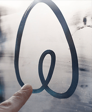
According to the London-based design studio behind the project (confusingly named Design Studio), the logo was inspired by German designer Kurt Wiedeman’s theory that a great logo “is something you can draw in the sand with your toe” – or something a horny schoolboy might doodle in the back of his exercise book, or in the condensation on a window, as the case may be.
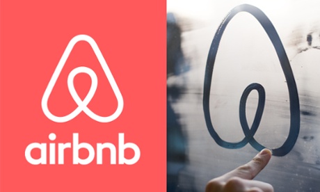
In the eyes of Airbnb, it is a conflation of a person with their arms outstretched, as if about to hug you, a map pin location marker, an upside-down heart, and of course their brand letter A. Christened the “Bélo”, the company says it is “an expression of what it truly means to belong anywhere”, a universal sign that the company hopes people will adopt and make their own. They want us to stick it on our windows and doors, tattoo it on our bodies, and make it as universally understood as the radiating lines of the Wi-Fi symbol. “Our logo belongs to everyone,” says the company, which even launched a create-your-own “community marque”, presumably hoping to see its logo woven as corn-dollies and cute papier-mache pretzels – but which instead beckoned forth the tidal wave of parody.
The red and white heart-cum-orifice replaces the company's endearingly naff former logo, drawn in a handwritten “Wish you were here!” postcard style, outlined in white and originally filled in with a blue gradient. It had a comforting, cushiony casualness that fitted with the culture of couch-surfing.
The new crisp infinity loop is something entirely different, exuding the reassuring power of a health insurance company more than the make-do and get-by of the DIY sharing economy. It is intended to address an increasingly mainstream audience and, accordingly, the clip-arty font (coincidentally named Bello) has been replaced by the more grown-up sans-serif Circular. The switch from blue to red, meanwhile, is clearly an attempt to escape the cacophony of blues elsewhere – used by Twitter, Facebook, LinkedIn and the host of others – in a trend that has itself spawned an online game of “Name that blue”.
In all, the new marque is a fitting mirror of what Airbnb has become: catapulted from a bedroom start-up to a global empire that threatens to put mass hotel chains out of business. In its memorable simplicity, it has an instantly recognisable graphic power equal to the company's increasing ubiquity.
But, while it's possible to see all kinds of things in the twirling Bélo, from genitalia to paper clips, the graphic design world has been quick to spot other similarities. There are also echoes of both the Habitat brand and Monocle magazine's symbol. Yesterday, German graphics guru Erik Spiekermann posted a tweet showing the new Airbnb logo alongside two other existing brands with almost identical marques, Network and Automation Anywhere:
Perhaps there’s something in the water: @Airbnb @n3tworkco pic.twitter.com/0ql3gWmyLn
— erik spiekermann (@espiekermann) July 17, 2014
Airbnb and Automation Anywhere have since released a joint statement clearing up any accusations of plagiarism:
“In early 2014 both Airbnb and Automation Anywhere began use of new logos that, by coincidence, have similar designs. Airbnb and Automation Anywhere are working cooperatively to address this issue, and Automation Anywhere is in the process of transitioning to a new logo design that is not similar to the Airbnb logo.”
Whatever life their new logo takes on, at least Airbnb can rest assured that it doesn't look like Lisa Simpson giving someone a blowjob.
